BB 20";padding-right:7px;padding-right:.7rem}.sidebar ul>li:last-child{margin-bottom:0}.sidebar .widget{margin-bottom:20px;margin-bottom:2rem}.post-stats{font-size:9px;font-weight:700}@media only screen and (-webkit-min-device-pixel-ratio:1.5),only screen and (-moz-min-device-pixel-ratio:1.5),only screen and (-o-min-device-pixel-ratio:3/2),only screen and (min-device-pixel-ratio:1.5){.header-image .site-header .wrap{background:url(/wp-content/themes/foodie/images/logo@2x.png) no-repeat top left;background-size:320px 136px}}@media only screen and (max-width:1139px){.header-image .title-area{width:50%}.site-inner,.wrap{max-width:960px;overflow:hidden}.content{width:620px}.genesis-nav-menu a{padding:16px;padding:1.6rem}.sidebar-primary,.title-area{width:300px}}@media only screen and (max-width:1023px){.content,.sidebar-primary,.site-inner,.title-area,.wrap{width:100%}.header-image .title-area{height:150px}.site-inner{padding-left:5%;padding-right:5%}.entry,.sidebar .widget,.site-header{padding:0}.genesis-nav-menu li{float:none}.genesis-nav-menu,.site-description,.site-header .title-area{text-align:center}.site-title{height:120px;margin:6px 0 0}}@media only screen and (min-width:941px){.nav-primary{display:block!important}}@media only screen and (max-width:940px){.menu-toggle span{border-top:1px solid #777;border-bottom:1px solid #777;display:block;visibility:visible;text-align:center;margin:0 auto}.menu-toggle span a{display:block;color:#333;font-size:12px;font-size:1.2rem;letter-spacing:2px;letter-spacing:.2rem;line-height:1.5;padding:16px 0;padding:1.6rem 0;text-transform:uppercase}.nav-primary{display:none}.nav-primary .genesis-nav-menu{border-top:medium none;margin-bottom:-1px;padding-bottom:1px}.nav-primary .genesis-nav-menu .menu-item{display:block}.nav-primary .genesis-nav-menu a{border:none;border-bottom:1px solid #9d9d9d;padding:15px 5%;padding:1.5rem 5%;width:100%}.genesis-nav-menu .sub-menu{left:0;margin:0;opacity:1;position:relative;width:100%}.nav-primary .genesis-nav-menu .sub-menu a{padding:15px 8%;padding:1.5rem 8%}}@media only screen and (max-width:480px){.header-image .site-header .wrap{background:url(/wp-content/themes/foodie/images/logo-480.png) no-repeat top left;background-size:320px auto;margin:4px 0 0}.header-image .title-area{height:80px}}.entry-time{display:none}.entry-header .entry-meta{display:none}.entry-title{margin-bottom:11px}.header-image .site-title a{background-image:url("https://aspoonfulofsugardesigns.com/wp-content/uploads/2024/11/A_Spoonful_of-_Sugar-Logo.svg");margin-top:-28px;margin-bottom:10px;background-repeat:no-repeat;min-height:160px}:root{--wpforms-field-border-radius:3px;--wpforms-field-border-style:solid;--wpforms-field-border-size:1px;--wpforms-field-background-color:#fff;--wpforms-field-border-color:rgba(0,0,0,.25);--wpforms-field-border-color-spare:rgba(0,0,0,.25);--wpforms-field-text-color:rgba(0,0,0,.7);--wpforms-field-menu-color:#fff;--wpforms-label-color:rgba(0,0,0,.85);--wpforms-label-sublabel-color:rgba(0,0,0,.55);--wpforms-label-error-color:#d63637;--wpforms-button-border-radius:3px;--wpforms-button-border-style:none;--wpforms-button-border-size:1px;--wpforms-button-background-color:#066aab;--wpforms-button-border-color:#066aab;--wpforms-button-text-color:#fff;--wpforms-page-break-color:#066aab;--wpforms-background-image:none;--wpforms-background-position:center center;--wpforms-background-repeat:no-repeat;--wpforms-background-size:cover;--wpforms-background-width:100px;--wpforms-background-height:100px;--wpforms-background-color:rgba(0,0,0,0);--wpforms-background-url:none;--wpforms-container-padding:0px;--wpforms-container-border-style:none;--wpforms-container-border-width:1px;--wpforms-container-border-color:#000;--wpforms-container-border-radius:3px;--wpforms-field-size-input-height:43px;--wpforms-field-size-input-spacing:15px;--wpforms-field-size-font-size:16px;--wpforms-field-size-line-height:19px;--wpforms-field-size-padding-h:14px;--wpforms-field-size-checkbox-size:16px;--wpforms-field-size-sublabel-spacing:5px;--wpforms-field-size-icon-size:1;--wpforms-label-size-font-size:16px;--wpforms-label-size-line-height:19px;--wpforms-label-size-sublabel-font-size:14px;--wpforms-label-size-sublabel-line-height:17px;--wpforms-button-size-font-size:17px;--wpforms-button-size-height:41px;--wpforms-button-size-padding-h:15px;--wpforms-button-size-margin-top:10px;--wpforms-container-shadow-size-box-shadow:none}.css-button{font-family:Arial,Helvetica,sans-serif;color:#fff;font-size:14px;border-radius:5px;background-color:#80ceca;display:flex;align-items:center;margin:18px auto 0 auto;width:285px}.css-button-icon{padding:7px 10px 10px 22px}.css-button-icon svg{vertical-align:middle;position:relative}.css-button-text{padding:12px 20px 12px 0}.modal{display:none;position:fixed;z-index:999;padding-top:100px;left:0;top:0;width:100%;height:100%;overflow:auto;background-color:#000;background-color:rgba(0,0,0,.4)}.modal-content{background-color:#fefefe;margin:80px auto;padding:20px;width:810px}@media only screen and (max-width:810px){.modal-content{width:400px}}.close{color:#aaa;float:right;font-size:28px;font-weight:700}body{top:0!important}@media screen{#simple-social-icons-4 ul li a{background-color:#7cddd2!important;border-radius:30px;color:#fff!important;border:0 #fff solid!important;font-size:16px;padding:8px}}
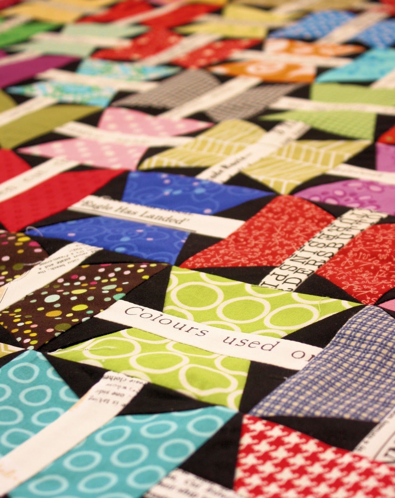
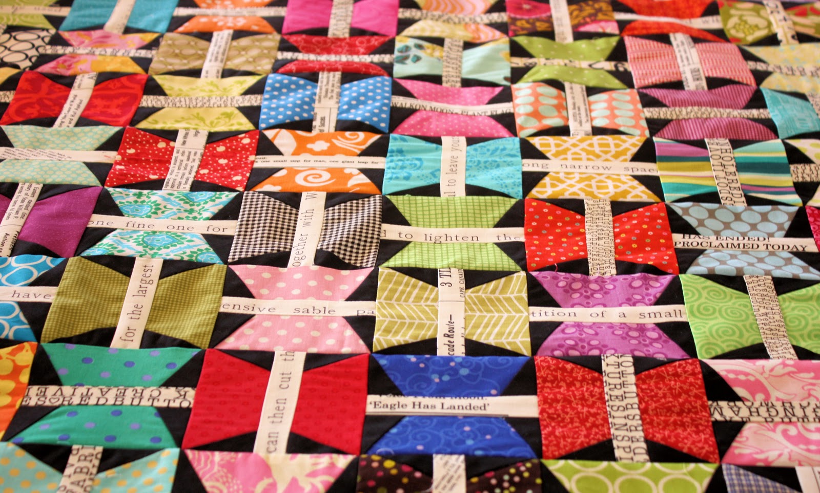
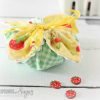
I have been steadily working away on my Butterfly Quilt (mentioned here and here) using lots of different colourful scraps. My vision for the quilt has shrunk from a single bed size down to a lap quilt (after 144 butterflies I would like to finish up) This is the first real scrap quilt I have made and I am finding it rather busy, albeit colourful. My scrap container is certainly lighter!
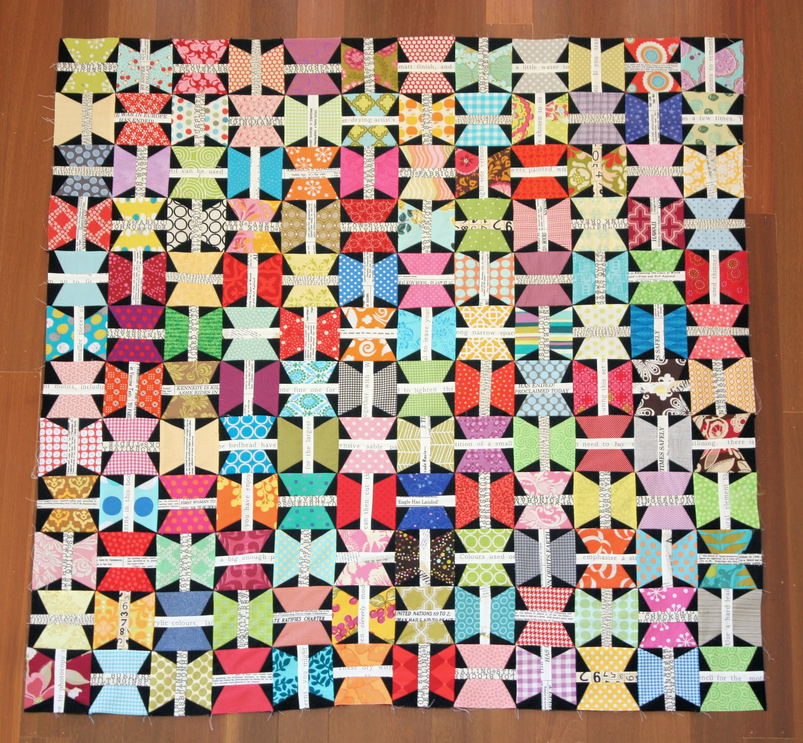
I could really use some input on how to finish it off. I am deliberating whether a solid border would work best (perhaps white or black) to help tone it down a bit. Alternatively, perhaps a black and grey polka dot, black and white rings, or black heath print would work well (see images below).
Or maybe I need something more colourful? All suggestions and ideas are welcome 🙂
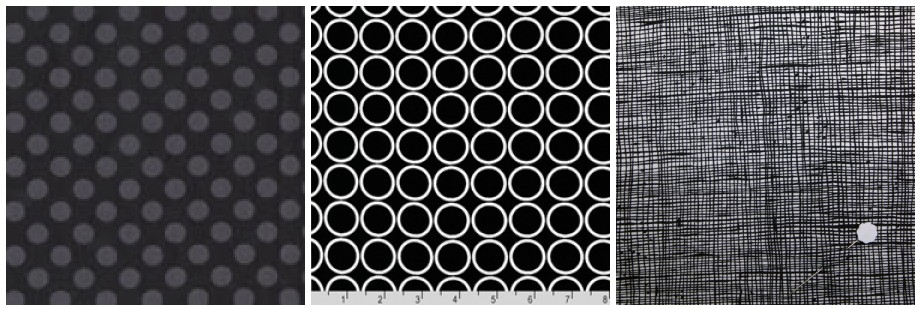
For the backing, I am planning using a text print to co-ordinate with the centre of all the butterflies. Hometown is one of my current favourites.
I have one more day of work left before a two week break over the school holidays. Hope to get this quilt nearly completed – I am already dreaming of the next quilt:)
Wow – that looks completely AMAZING! I can only imagine the amount of work you’ve put into it. My vote is the black and white rings or the polka dot…it would be great to see some pics with both these lying alongside the butterflies, just to get a better visual idea of how they look. I’m sure whatever you pick will be stunning!
Wonderful quilt, dear Lisa! I would border it in white, solid black for the front. I am sure you will decide on the best!! Spring arrived a little hot around here. Rainy and hot! Have a great day, dear Lisa! Bela
*sigh* I love Hometown. So excellent choice there! Scrappy quilts are just so lovely. I would go for the rings (I’m a dramatic type obviously), but either of the other two would be ok. I would prefer the prints to plains.
it’s so awesome! the contrast of the black fabric backgrounds and the white typed fabric…perfect! my choice is a dot for the binding. with all of the straight angles in the quilt, the dots would give some “roundness” to the edge.
I love the circles but I think they are too vibrant for this quilt. I would use the polka dot if I was making it for me. The butterflies are lovely – great idea to use the words for the bodies.
What a fun project to be working on. Looks like a great way to use scraps, something I find quite challenging. I vote for the black and grey polka dot too.
Wow this is spectacular – I’d go for the darkest border too – any other color or patter would draw that particular color from the center. Very well done! Your newest follower! 🙂 Kathy
Wow – looks amazing! I would do a thin (1″ finished or less) white border, with a thicker black border. I think that would frame it out and help contain all the gorgeous color you have going on.
It’s beautiful! You’ve taken those scraps and transformed them into gorgeous butterflies. I LOVE it!
Hmmm…What about a double border? I thinking the black & white rings look fab with the black heath print. I know that whatever you decide, it will be perfect.
Since you asked… Personally, I think the black with white rings is too busy for the quilt (I love that fabric, but not for this application). My preference would be the one that looks like linen. Or maybe even a solid black with no print or texture – to match what you used on the blocks. LOVE your blog. I’m sure whatever you choose will be super-cute!
Hi! I’m fascinated by this. Did you use the same text print for each center or did you naturally have many? If you used the same text print, may I ask which one? Love it!
This looks great! I keep changing my mind about which of these 3 I’d use but I think all of them would look great but so would bringing one color out….. Can’t wait to see what you decide.
I think with all the bright colors and business of the butterflies etc and the backing you plan to use that I would use a solid black binding. That will finish off the edges like a frame and not detract from the beautiful colors and will also look awesome with the backing.
I’d go for the polka dot.
Wow they look amazing! I love scrap quilts. I would go for the darkest border.
Cheers
Linda
Wow – that looks completely AMAZING! I can only imagine the amount of work you’ve put into it. My vote is the black and white rings or the polka dot…it would be great to see some pics with both these lying alongside the butterflies, just to get a better visual idea of how they look. I’m sure whatever you pick will be stunning!
Do you really have to ask? LOL…the polkadot, of course! I really love how colourful your quilt is…just stunning. Enjoy the holidays xxx
I would go for the polka dot.
Actually, I think I would go for the rings. 🙂
I think I like the polka dots the best! Lovely quilt!
Awesome! I like the black/grey dot too – less interference with your colourful blocks.
This quilt is a stunner, I love it. For a border with a lot of work how about the heath, with butterflies appliqued randomly over it?!! xo
Yes I would like the polka dot border too.
Oh my, now that’s a lot of work!! I like the black-grey polkadot best for the boarder. Oh my, it’s gonna be a great quilt.
Esther.
Wonderful quilt, dear Lisa! I would border it in white, solid black for the front. I am sure you will decide on the best!!
Spring arrived a little hot around here. Rainy and hot!
Have a great day, dear Lisa!
Bela
Love this quilt! I know I’m in the minority but I say go for the rings.
*sigh* I love Hometown. So excellent choice there! Scrappy quilts are just so lovely. I would go for the rings (I’m a dramatic type obviously), but either of the other two would be ok. I would prefer the prints to plains.
Love it so far.
it’s so awesome! the contrast of the black fabric backgrounds and the white typed fabric…perfect! my choice is a dot for the binding. with all of the straight angles in the quilt, the dots would give some “roundness” to the edge.
I love the circles but I think they are too vibrant for this quilt. I would use the polka dot if I was making it for me.
The butterflies are lovely – great idea to use the words for the bodies.
It looks stunning Lisa, I would opt for the rings as I think the grey polka dots are a bit flat. I can’t wait for the holidays.
very very beautiful!!!
i like all your jobs :o)
kiss
I am thinking the Heath…love Heath:)
It is really pretty though!!
Isn’t that funny that we start thinking about our next quilt way before we finish the current one?!
Haha — I see everyone has a different opinion! You’re making great progress on this quilt Lisa — I know you’ll make a great border choice!
This quilt is fabulous!!! I think the black and grey dot would look great! But however you finish it is will be an amazing quilt.
What a fun project to be working on. Looks like a great way to use scraps, something I find quite challenging. I vote for the black and grey polka dot too.
i just love the butterfly quilt! so beautiful and colorful!! my vote is for the polka dots… looking forward to seeing the finished quilt 🙂
Oh how pretty! I say go for the rings.
Hi! Greetings from Finland! I love it! The colors are so fresh! It’s so nice to find other quilters all around the world! Have a nice day!
Wow this is spectacular – I’d go for the darkest border too – any other color or patter would draw that particular color from the center. Very well done!
Your newest follower!
🙂
Kathy
Wow – looks amazing! I would do a thin (1″ finished or less) white border, with a thicker black border. I think that would frame it out and help contain all the gorgeous color you have going on.
It’s beautiful! You’ve taken those scraps and transformed them into gorgeous butterflies. I LOVE it!
Hmmm…What about a double border? I thinking the black & white rings look fab with the black heath print. I know that whatever you decide, it will be perfect.
Since you asked… Personally, I think the black with white rings is too busy for the quilt (I love that fabric, but not for this application). My preference would be the one that looks like linen. Or maybe even a solid black with no print or texture – to match what you used on the blocks. LOVE your blog. I’m sure whatever you choose will be super-cute!
I think it’s gorgeous! I would go for solid black or the black with white rings..
Polka dots, the darker the better, so the rich colours stand out. Lovely work!
Hi! I’m fascinated by this. Did you use the same text print for each center or did you naturally have many? If you used the same text print, may I ask which one? Love it!
Hmmm…I think the black heath print, but you’ll be living with it 🙂
It looks amazing, it has been so lovely to watch the progress of this quilt 😉 My pick would be the rings – i’m a sucker for B&W. See you soon xx
such gorgeousness!! I’d go a strip of black and the polka dots. happy holidays 🙂
Wonderful quilt, I like it!
Beertje Zonn
Love the quilt!! I think the black with gray polka dots would look good around the edges. Love it.
This looks great! I keep changing my mind about which of these 3 I’d use but I think all of them would look great but so would bringing one color out….. Can’t wait to see what you decide.
It looks great! A very Happy quilt 🙂 I like the fabric on the right side for the border… but they all look nice though!
beautiful quilt! I would use either the rings or the dots, but rings would be my first choice….unless you have a black and white dot 🙂
I love it. I really do. It is hard to say what would work best. You’ll make the right choice.
It`s stunning,I love it.
I think with all the bright colors and business of the butterflies etc and the backing you plan to use that I would use a solid black binding. That will finish off the edges like a frame and not detract from the beautiful colors and will also look awesome with the backing.